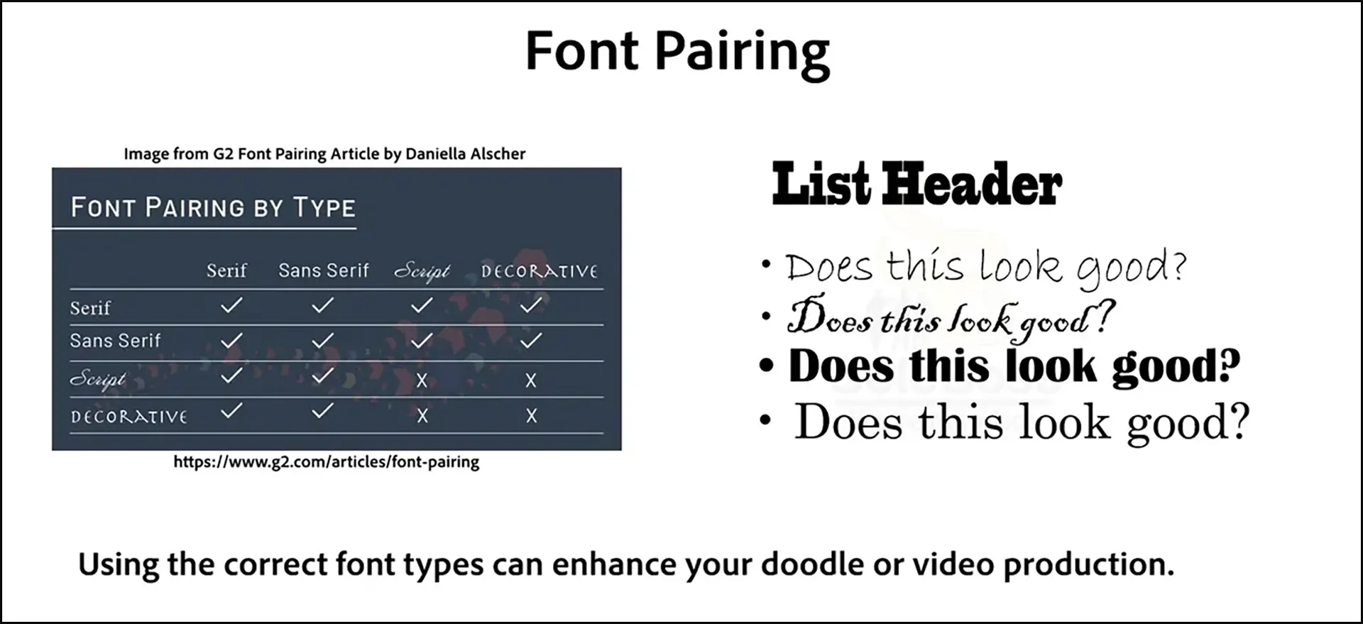
Font Pairing
Discusses when there are too many fonts and when fonts do and do not appear harmonious together. Provides examples of good and bad fonts used together.
Pre-requisites
Beginner Skill Level Doodly Tutorial #20: Choosing Fonts
Beginner Skill Level Doodly Tutorial #7: Working with Font Types
If you haven’t read those yet, please read those prior to reading this one.
What is Font Pairing?
This is the act of placing fonts that work well together and such as a list header and a the list body a chapter name in a story and the story itself.
Good Practices
- Using fonts from the same font family. Verdana, Helvetica, Times New Roman are examples font families.
- Pairing noticeably distinct fonts with ordinary fonts. An example would be using a script type font with sans-serif type font.
- Using Weight and Size properly. Differentiating by using a bold may not be enough of a distinction but it is a good practice to allow the viewer to understand what is important and where we want their focus.
Practices to Avoid
- Similar fonts. Staying with similar fonts is not being safe. Exactly the opposite holds true when working with multiple fonts. Sticking to too similar of a font type can cause confusion for the viewer.
- Drastically contrasting fonts has the opposite effect and can drive the viewer away from the message. Fonts that don’t have at least a little bit in common won’t work well together either. They won’t transition smoothly from one place to another.
- Too many fonts. Having too many fonts, not just in 1 scene but throughout the entire doodle is not a good thing. No more than 3 fonts should be used throughout the entire project. Decide on what those fonts will be and how they will be used and stick with them.
Font Pairing Resources
Font Pair is an amazing website that allows for use of seeing what font pairs work in a variety of colors.
Font Pair Website
Typography in 10 minutes will help when learning how and where to place fonts on the canvas.
Typography in Ten Minutes


